
As the climate crisis intensifies, understanding the distribution of carbon emissions globally has become critical. Originally created for a World Bank competition and recently updated for The Guardian, CarbonMap.org is a powerful tool that uses interactive maps to illustrate the inequality in carbon emissions, responsibility, and vulnerability across countries. This tool provides a unique perspective on how different countries contribute to, and are affected by, climate change—helping to make the case for a fairer, more equitable approach to climate action.
What is CarbonMap.org?
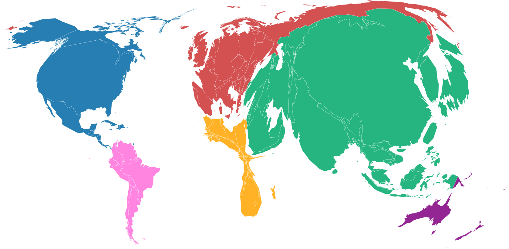
CarbonMap.org is an interactive, data-driven platform that visualises global carbon emissions, resource distribution, and climate vulnerability through a series of thematic maps. Unlike traditional maps, which represent countries based on land area, CarbonMap.org uses a cartogram approach to skew the size of each country based on various climate-related metrics, such as:
- Current Emissions: This map shows which countries are emitting the most CO₂ today, reshaping countries based on the volume of their current emissions.
- Historical Emissions: This view emphasises which nations bear the greatest responsibility for the accumulated carbon in our atmosphere, highlighting the long-term impact of industrialised countries.
- Per Capita Emissions: This map scales countries according to their emissions per person, spotlighting nations with high individual carbon footprints.
- Climate Vulnerability: Here, the map is reshaped to represent countries based on their susceptibility to climate-related impacts like rising sea levels, droughts, and extreme weather events.
These maps enable users to understand the stark contrasts between high-emission nations and those most vulnerable to climate change, providing a visual argument for climate justice.
Key Insights
CarbonMap.org offers insights into the relationship between emissions and inequality in several key ways:
- Disproportionate Emissions by Wealthier Nations: Maps depicting current and historical emissions reveal that wealthier nations have contributed disproportionately to global carbon levels. The United States, European Union countries, and other industrialised nations take up much larger areas on these maps, underscoring their role in contributing to climate change.
- High Per Capita Emissions: When examining per capita emissions, wealthy nations, particularly those with energy-intensive industries and high standards of living, again dominate the map. This view brings to light the connection between consumption levels and individual carbon footprints, suggesting that lifestyle changes in developed countries could make a significant difference.
- Climate Vulnerability in Low-Emission Nations: The climate vulnerability map is perhaps the most striking, as it reshapes the world to show how low-emission nations like Bangladesh, the Philippines, and various sub-Saharan African countries face the most immediate climate threats. These countries contribute the least to carbon emissions but suffer the greatest from climate impacts, underlining the injustice of the climate crisis.
- The Argument for Climate Equity: By presenting climate data through the lens of responsibility, capacity, and vulnerability, CarbonMap.org helps to make the case for climate equity. It visually reinforces the idea that countries contributing the most to emissions bear a moral obligation to support those most at risk.
How Businesses and Policymakers Can Make Use of CarbonMap.org
CarbonMap.org is more than just a visual communication resource—it is also a tool for driving action. Businesses, NGOs, and policymakers can leverage the insights from CarbonMap.org to develop understanding, guide decisions, and communicate the urgency of equitable climate action.
- For Policymakers: CarbonMap.org’s data can support arguments for policies that allocate climate funding and resources to vulnerable countries, advocate for emission reduction commitments from high-emission nations, and contribute to more balanced climate negotiations.
- For Businesses: All businesses, particularly those with international operations, can use the platform to assess their own carbon impacts and consider how their activities affect countries differently. It’s a reminder of the responsibility that large companies, particularly in high-emission sectors, have toward contributing to global climate solutions.
- For Educators and Advocates: CarbonMap.org is an excellent educational tool that can help raise awareness about climate justice. It provides a compelling way to visualise complex issues and communicate them to audiences who may not be as familiar with climate data or the disparities involved. Likewise this is a great tool for education and advocacy within businesses.
The Importance of Climate Data Transparency
Tools like CarbonMap.org underscore the importance of making climate data accessible and engaging. By reshaping our world based on carbon metrics rather than geographical size, the platform brings issues of emissions inequality and climate justice into sharp relief, challenging traditional perspectives and encouraging a more nuanced understanding of global responsibility.
CarbonMap.org is a powerful tool for understanding global carbon inequality, providing a compelling visual representation of emissions, responsibility, and vulnerability. As we work toward a more sustainable and equitable future, platforms like CarbonMap.org offer valuable insights into how emissions are distributed worldwide and help reinforce the need for climate action that considers the different capacities and vulnerabilities of nations.
Whether you’re an environmental advocate, a policymaker, a business leader, or simply an interested individual, CarbonMap.org is a resource that offers a unique perspective on one of the most pressing issues of our time. By acknowledging the disparities in carbon emissions and climate vulnerability, we can better understand and support the path toward global climate equity.
Kickstart your journey into sustainable growth, with all the tools you need to get going at Bright.
Start building your action plan for free, today or try our free Carbon Footprint Calculator

Leave a comment